Table of Contents
6. AERPLOT
6.1. Introduction to AERPLOT
AERPLOT is a supplementary tool for the atmospheric dispersion model AERMOD, developed by the U.S. EPA. Its main function is to generate graphical output files for simulated concentrations at different receptors. These files, with the `.plt` extension, contain concentration data associated with specific coordinates and elevations, and can be used for graphical visualization in GIS (Geographic Information System) tools such as QGIS.
AERPLOT does not create maps directly but facilitates the export of simulated data for spatial interpretation. In this way, it serves as a bridge between AERMOD's numerical results and the visual analysis of pollutant plumes in geographic space.
6.2. Graphical Visualization of Emission Plumes with AERMOD and QGIS
6.2.1 Exporting Data from AERMOD
To graphically visualize the emission plumes generated by AERMOD, we will use data from the bloomington.plt file, which needs to be converted into a CSV file:
- Open the
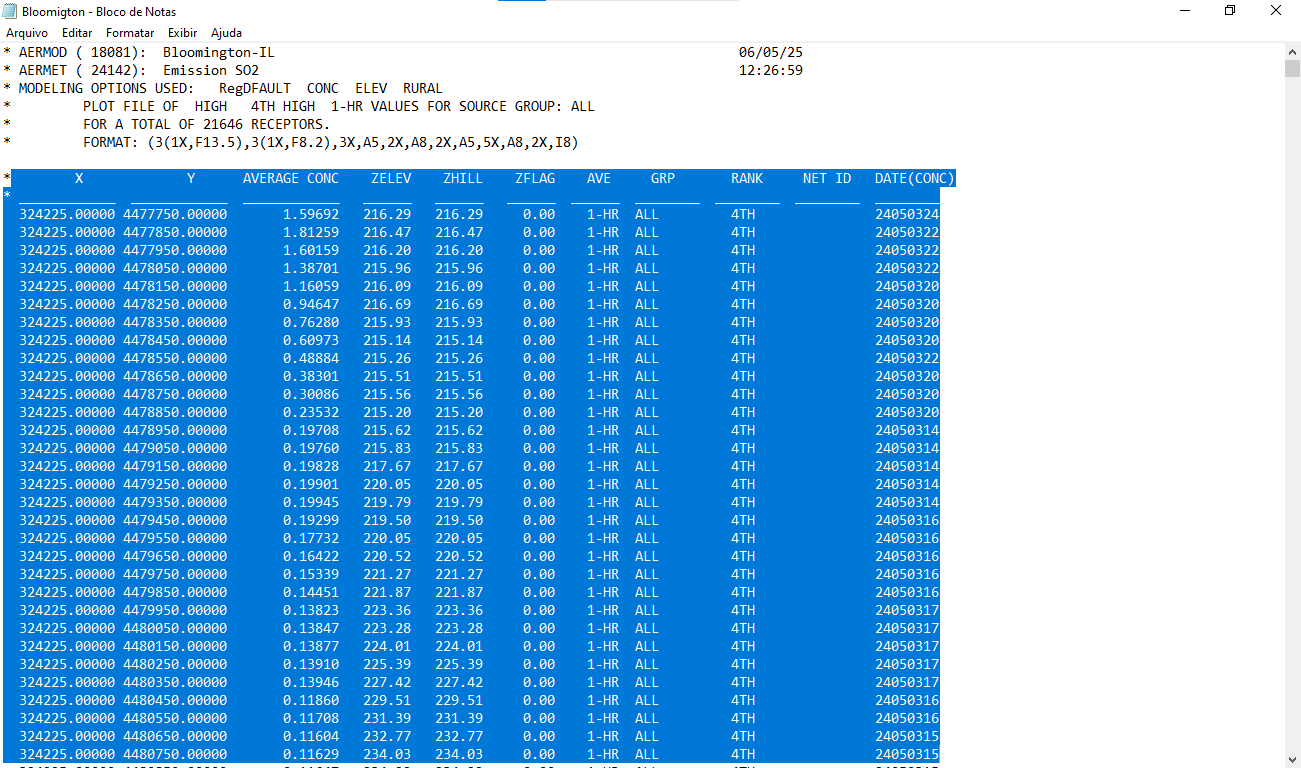
bloomington.pltfile. - Select all data from the point indicated in the image and copy it.
You can see an example of this in Figure 1.
Figure 1
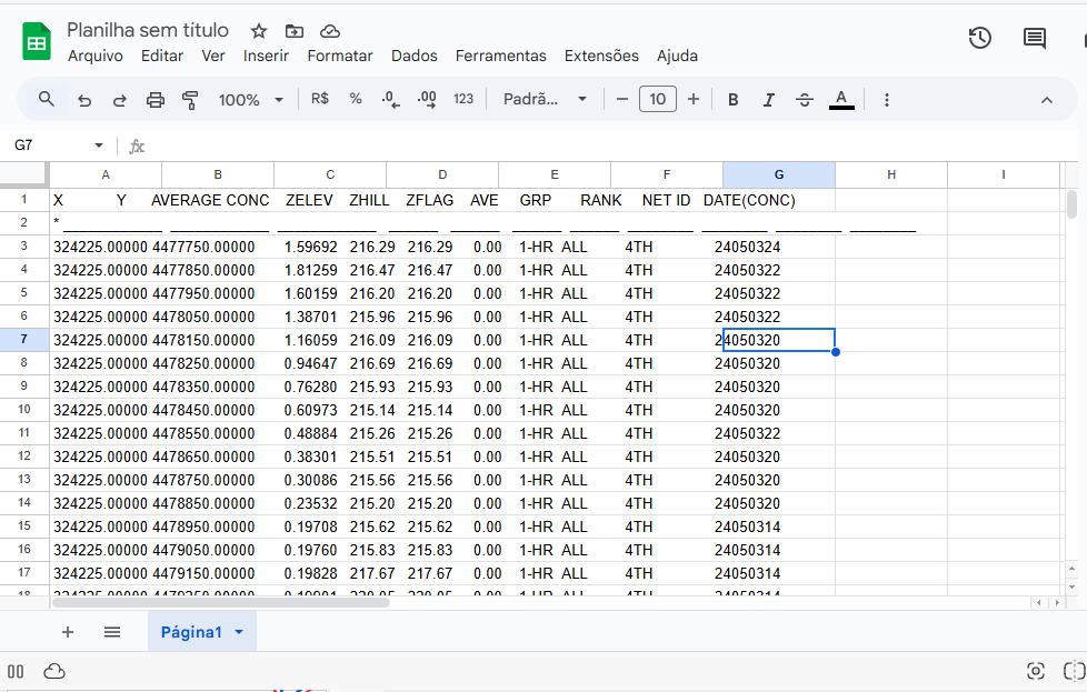
Now open google sheets and paste the data as shown in Figure 2.
Figure 2
6.2.2 Formatting the Spreadsheet
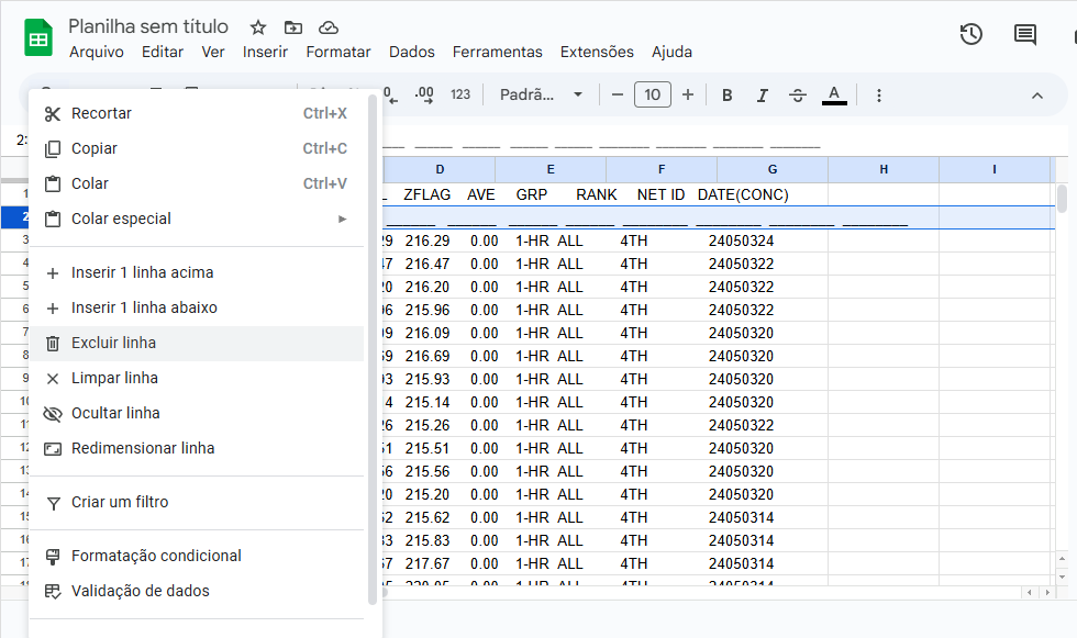
1. Delete Row 2 by right-clicking it and selecting Delete row, as shown in Figure 3.
Figure 3
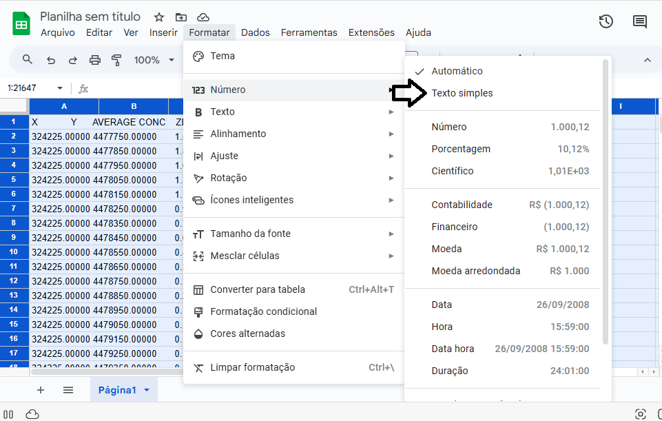
2. Select the entire sheet (`Ctrl+A`), go to Format > Number > Plain Text and click it. See Figure 4:
Figure 4
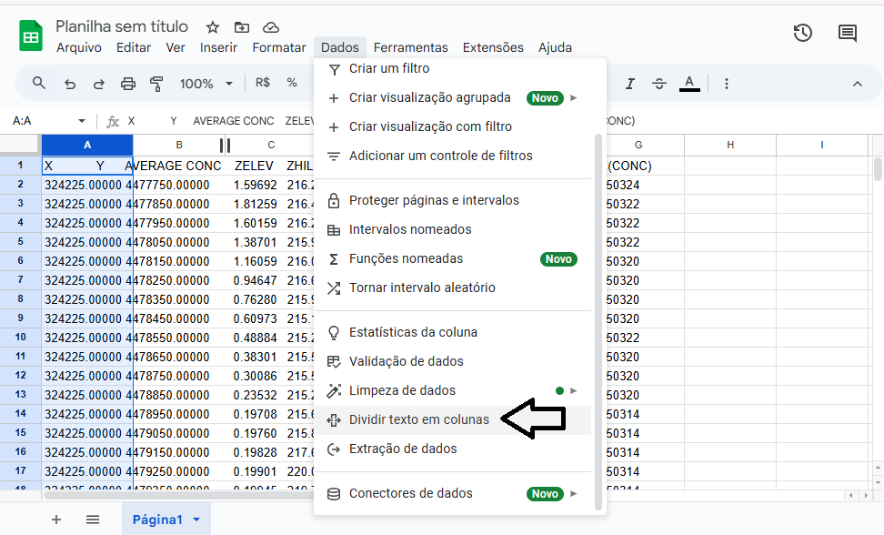
3. With Column A selected, go to Data > Split text to columns, as shown in Figure 5:
Figure 5
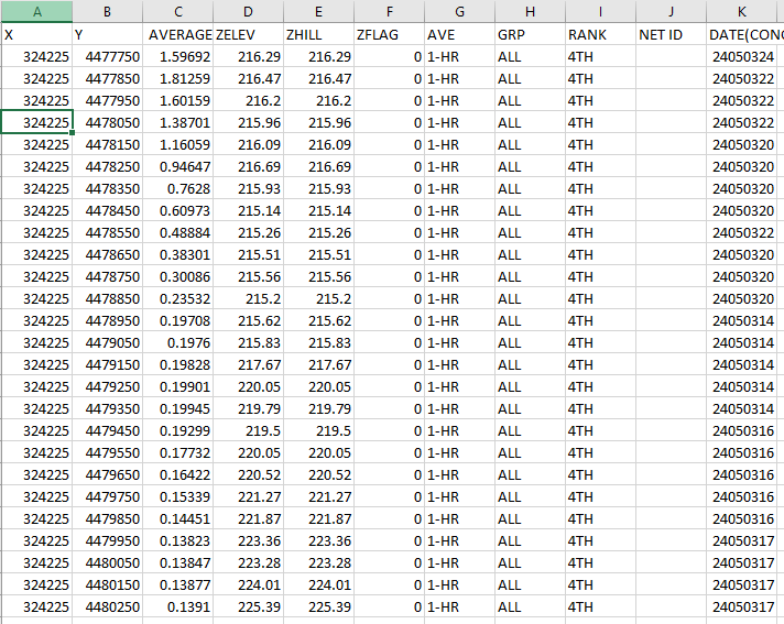
4. Adjust the first row headers to match the data in each column, as shown in Figure 6. This must be done manually, as the separation may vary.
Figure 6
5. Save the spreadsheet as `plot.csv` in the following directory:
''C:\Users\Cliente\Desktop\AermodTutorial\6.AERPLOT\''
6.2.3 Visualization in QGIS
With the formatted spreadsheet, we can now use QGIS to map the pollutant dispersion.
1. If you haven't installed QGIS yet, download it from QGIS_Download and complete the installation.
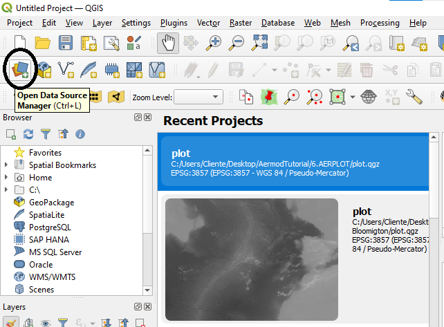
2. Open QGIS and click the Open Data Source Manager tab as shown in Figure 7.
Figure 7
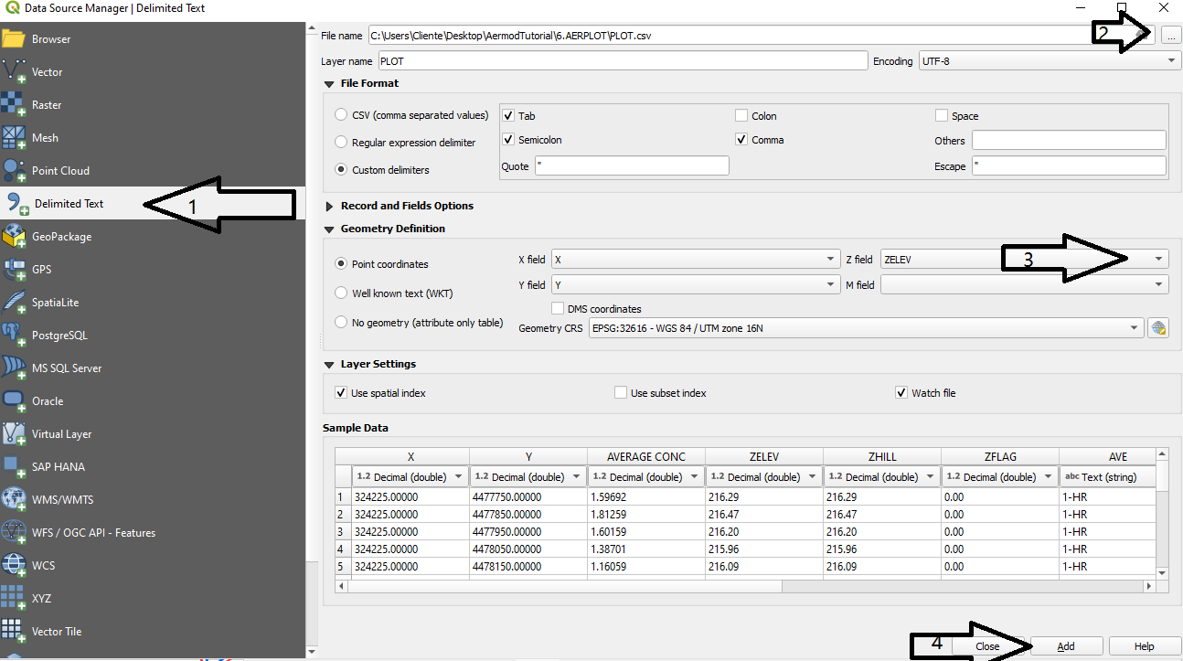
3. Follow the steps illustrated in Figure 8:
- Select Delimited Text;
- In File name, open the `plot.csv` file;
- In Z field, select the `ZELEV` field;
- Click Add.
Figure 8
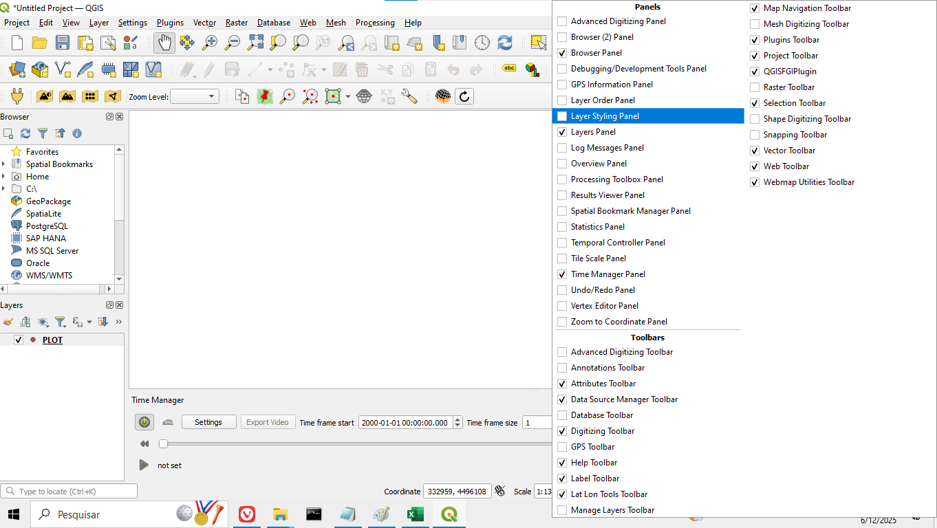
4. Close the import window and, on the main QGIS screen, right-click on the top bar and select Layer Styling Panel, as shown in Figure 9:
Figure 9
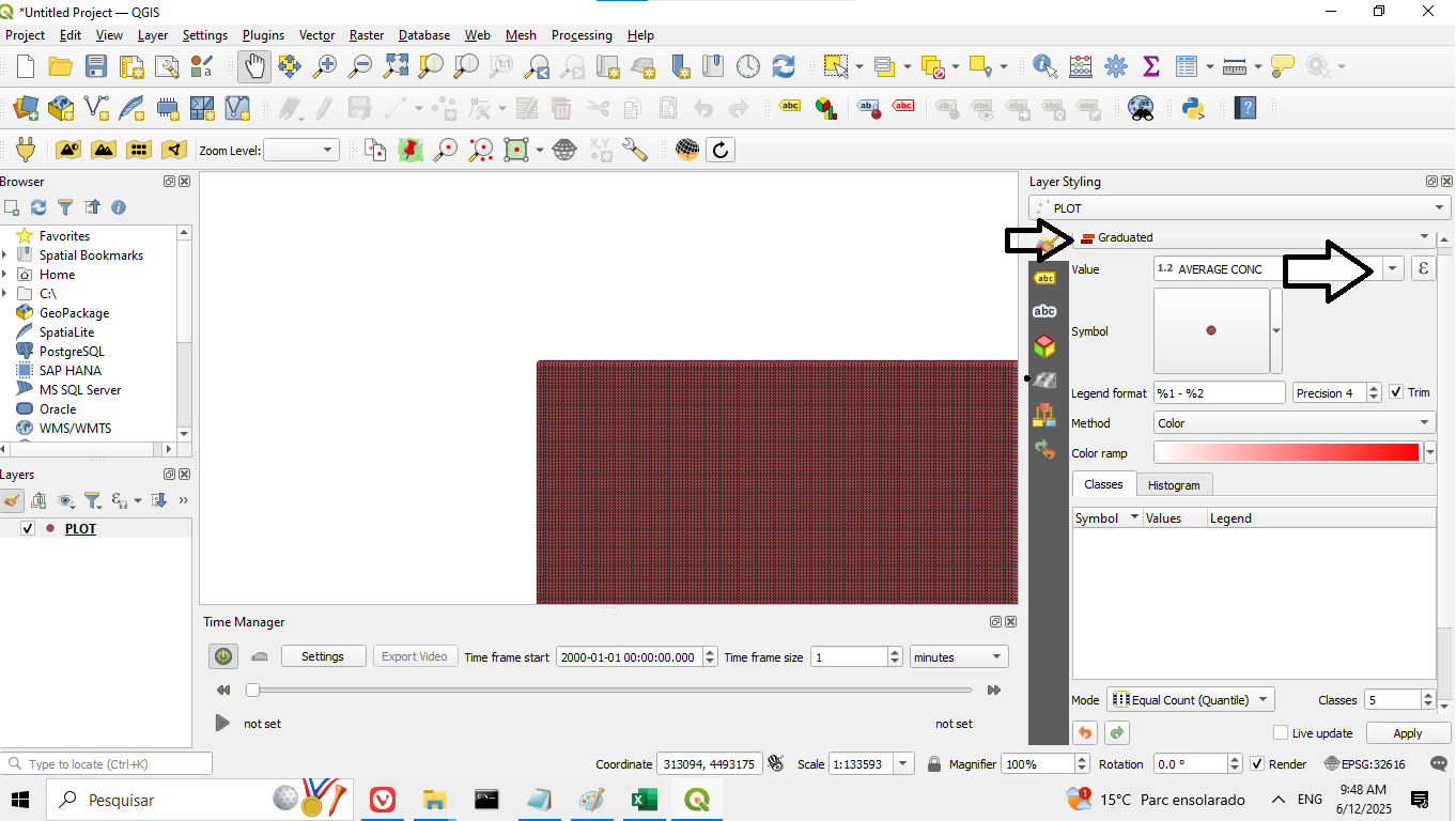
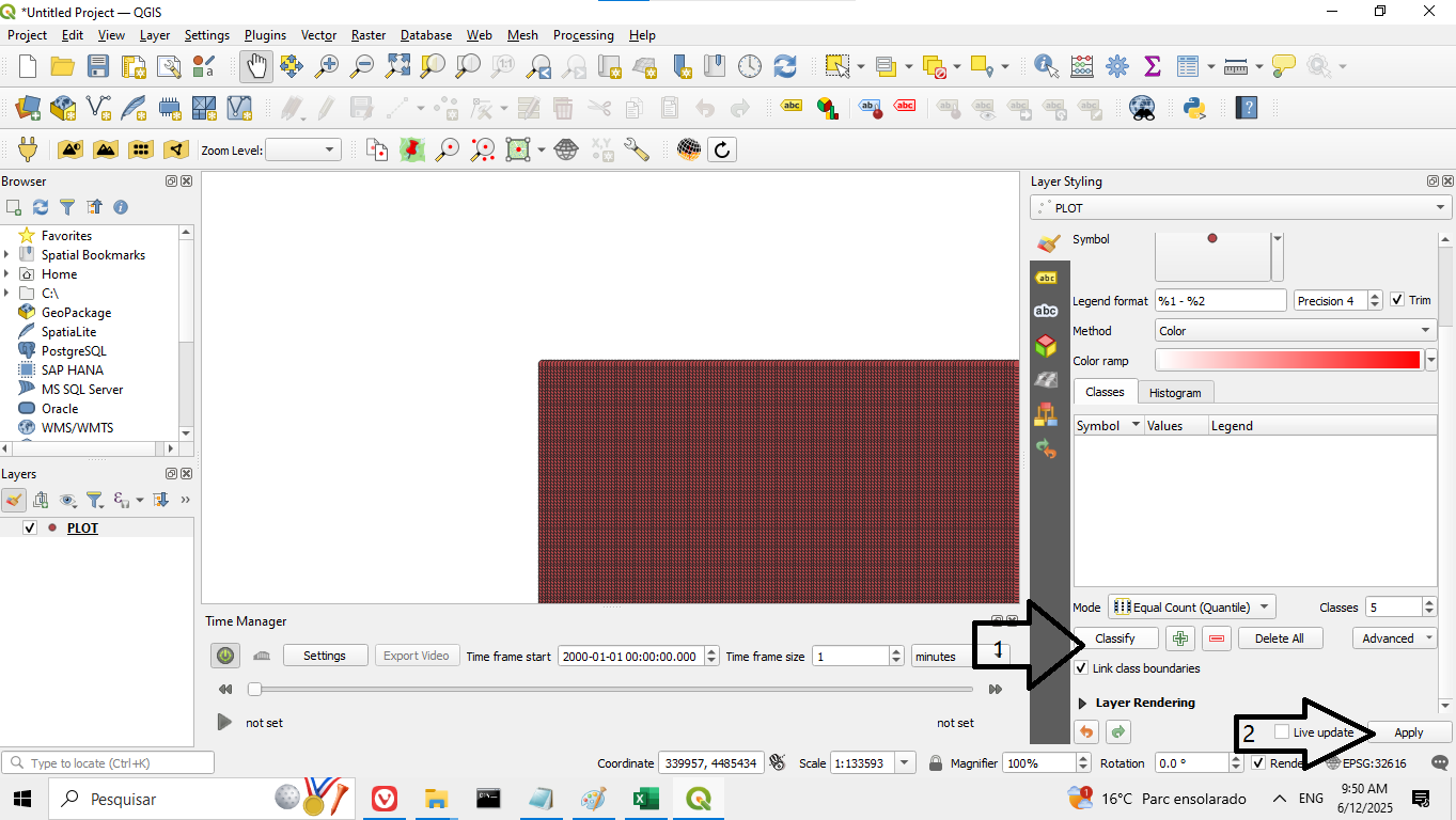
5. Access the symbology menu as shown in Figure 10. Then scroll down, click Classify, and finally click Apply, as shown in Figure 11:
Figure 10
Figure 11
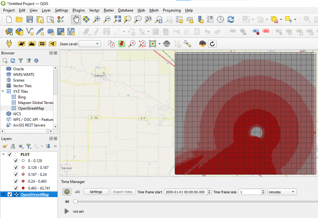
6. In the Browser panel, double-click OpenStreetMap to add the base map.
7. In the Layers panel, drag the OpenStreetMap layer to position it below the plot layer, as shown in Figure 12.
Figure 12
6.2.4 Final Result
You will now be able to visually analyze the dispersion of the modeled SO₂ pollutant in the Bloomington region. The spatial visualization allows for the identification of areas with the highest concentrations over time, based on the simulation data from AERMOD.
